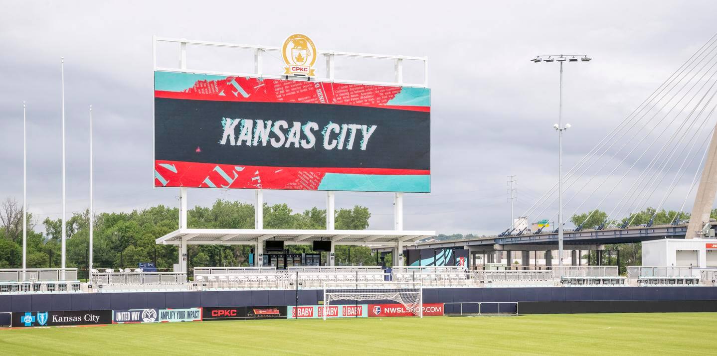
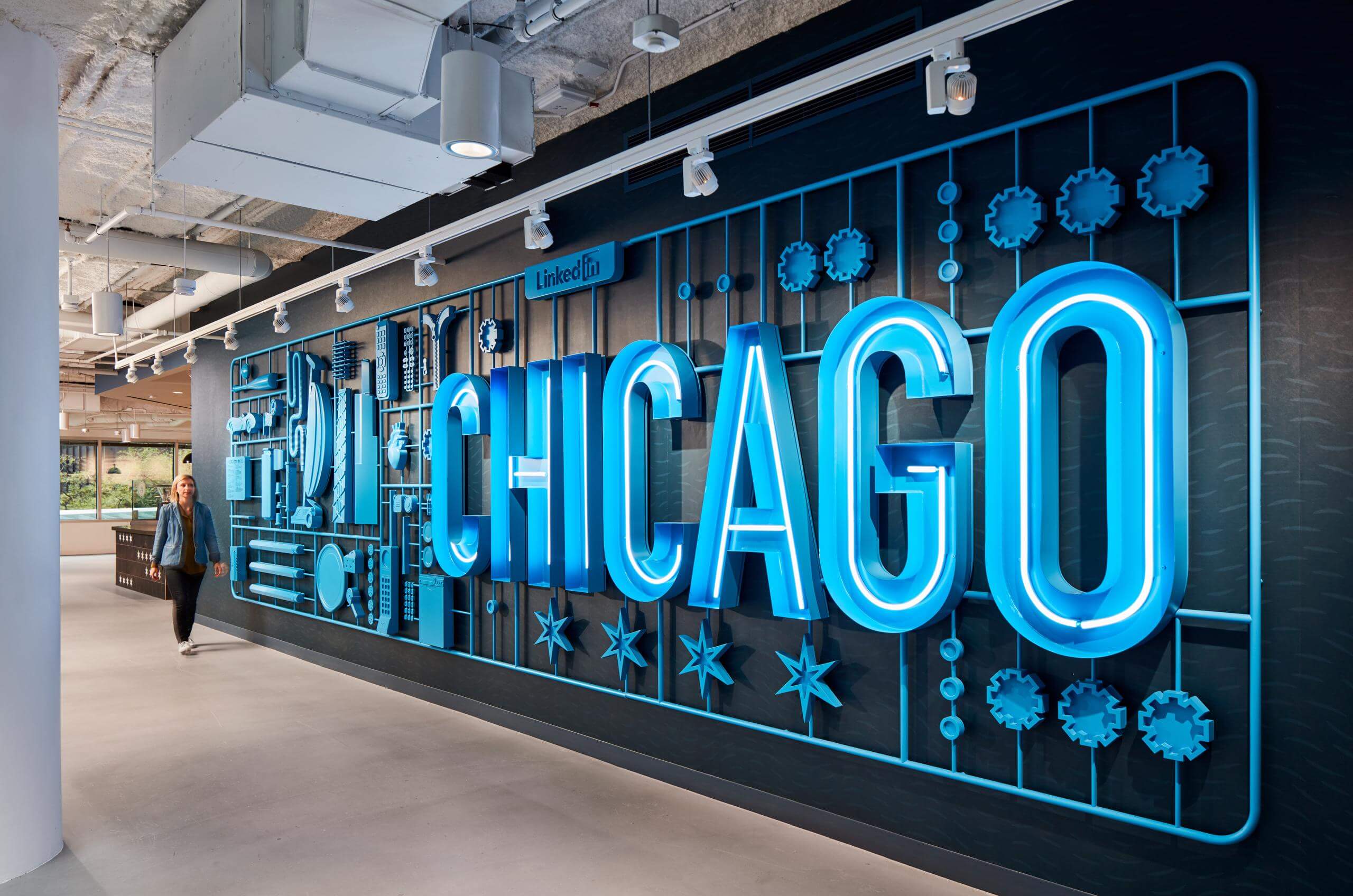
Signage and wayfinding is key to a seamless user experience inside any venue. If you are lost or confused ten steps into a building, your experience isn’t going to be great. Therefore creating intuitive and functional information systems is critical. Otherwise, it can become a memorable point of frustration for visitors.
That’s why we take a comprehensive, science-like approach to signage and wayfinding at DI. It’s more than plaques on a wall. Rather, it’s about studying the entire space, defining circulation paths and decision points to ensure all informational signage, wayfinding signage, and regulatory signage not only gives people the information they need but also organically complement and elevate the space and brand story.
LET’S START WITH THE BASICS
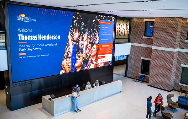
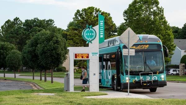
When we talk about signage, many people think of digital marquees or neon displays, which is only a piece of the larger story – at least in our book. While those are important (and very fun to design), larger venues and complicated buildings demand we go a step further. Developing an information system that drives visitors, fans, or patients through the building – and back out again – is paramount. When referring to this system, those in the industry typically use the term “signage and wayfinding.” It’s best to think of them as different concepts with the same end goal.
Wayfinding at its core is defined as finding one’s position and navigating your destination from that position. Think of using a compass while hiking. You need to define where you are first, figure out which way you want to go, and then find your way to that point. The same basic premise applies to wayfinding system design. How do we help folks navigate through the space/building/venue/etc. in an easy way?
Wayfinding can vary depending on the audience and venue, such as indoor vs. outdoor, single vs. multi-level spaces, and more. But most of the techniques and methodologies we use are the same. We start by asking ourselves a lot of questions… What are the decision points? What are the pinch points? Where do people enter? Where are they going? What is the audience? Then, we use those findings to plot decision points. From there, we start to define the best places for wayfinding, i.e., where it makes the most sense to the user. Then we define the nomenclature of the sign. The goal is to finish with a well-thought-out system that is nice to look at and easy to use.
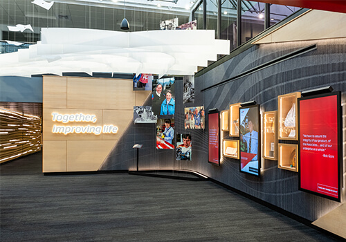
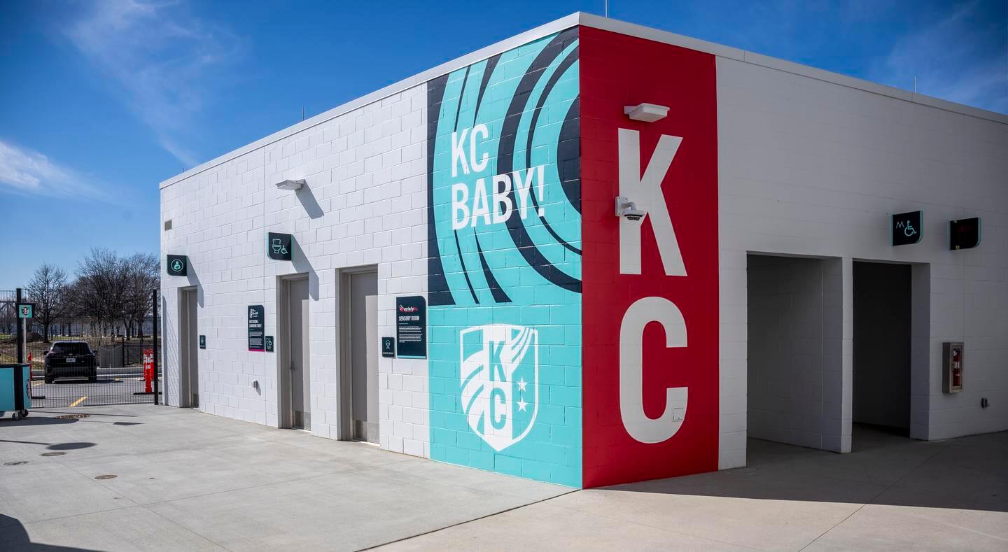
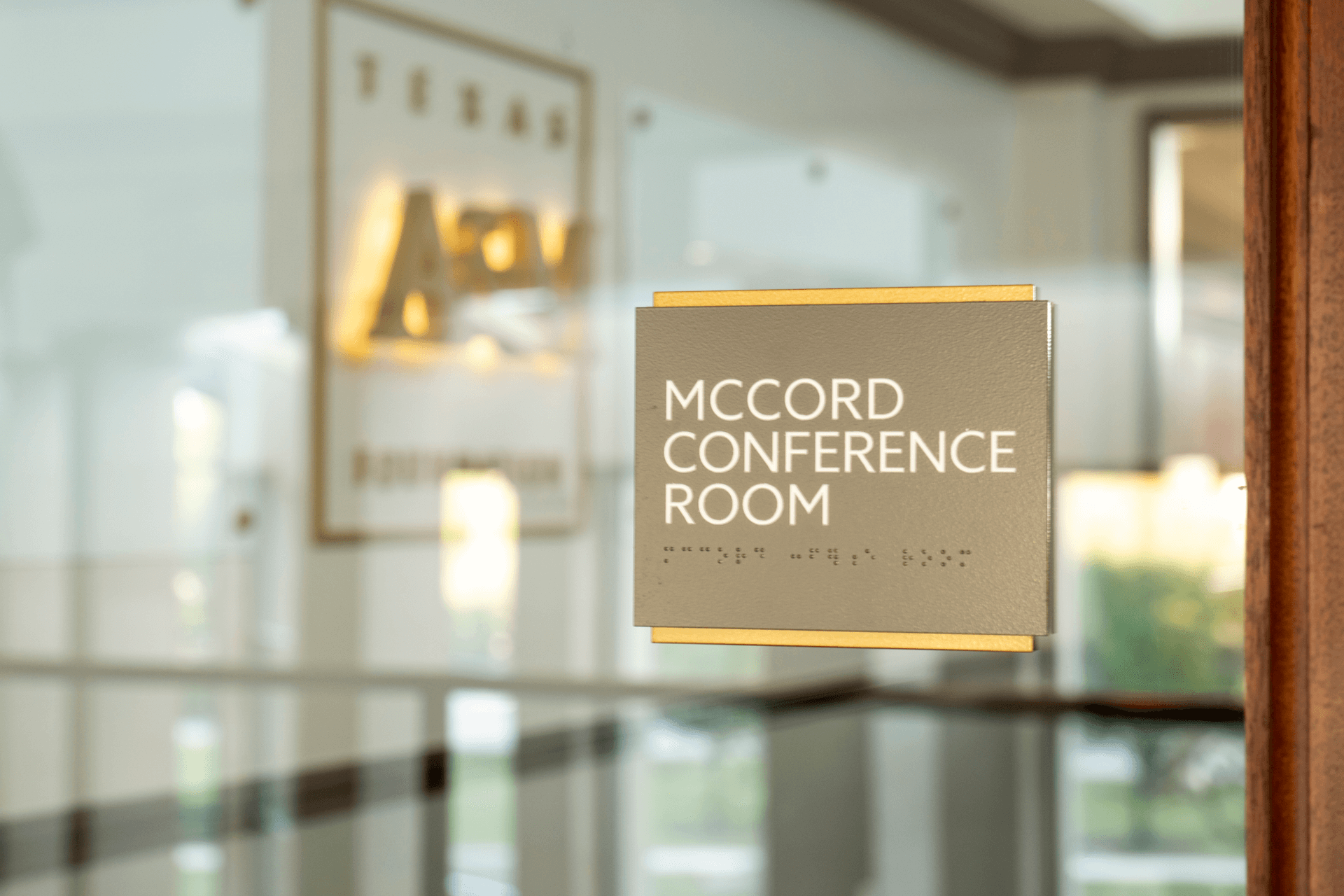
Signage is a bit of a vague term, but generally involves a large group of built elements that work in conjunction with wayfinding. Signage can involve historical and interpretive panels, branded elements, building signage, and donor signage. It also includes regulatory signage, which is the architectural and life safety components required for building occupancy and accessibility, such as Americans with Disabilities Act (ADA) compliance and emergency response details. A vital piece of the DI partnership is helping our clients ensure all regulatory signage is accounted for while considering color contrasts and other design elements, such as wall graphics.
SCIENCE OVER DESIGN
Regardless of signage and wayfinding design, most of the legwork comes from creating a system that’s smart, intuitive and functional. There’s a real science to it – in fact, it’s more science than design. Effective signage and wayfinding abide by an information hierarchy because if everything is important, nothing is important. Establishing tiers gives users the real-time information they need without being too overwhelming or confusing.
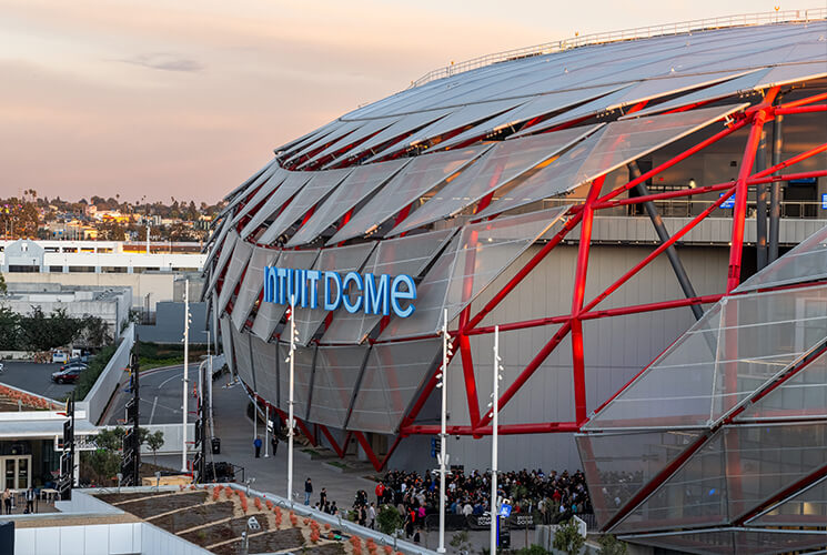
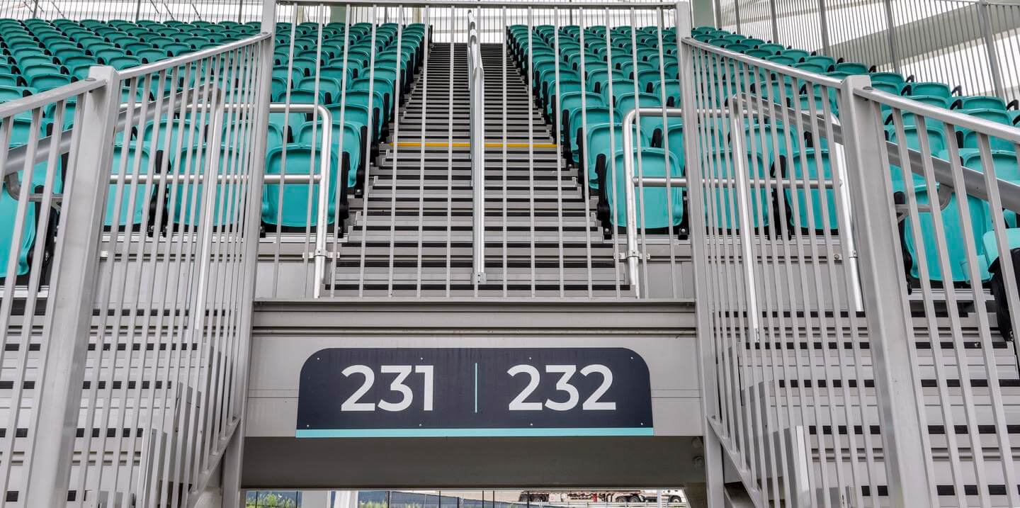
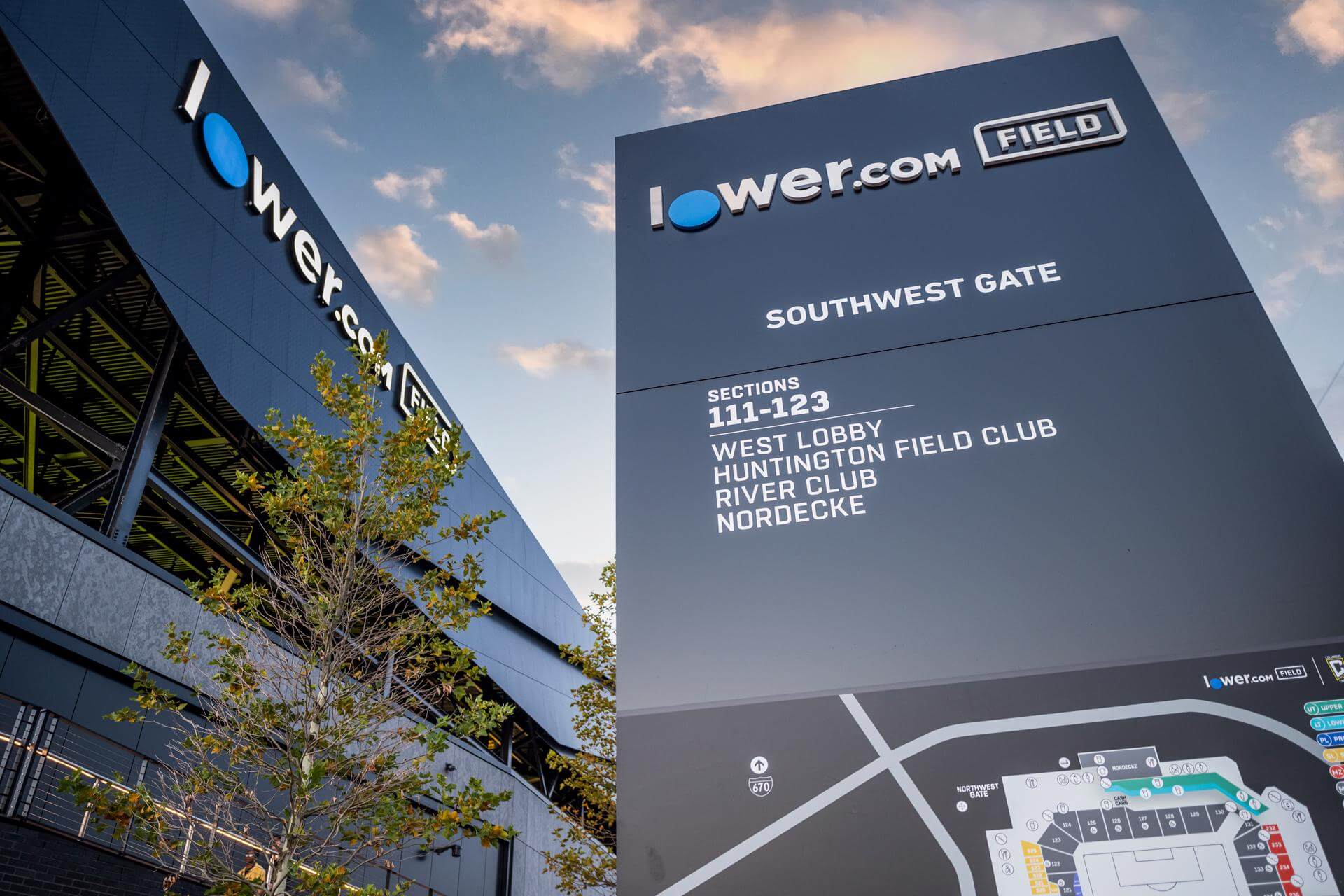
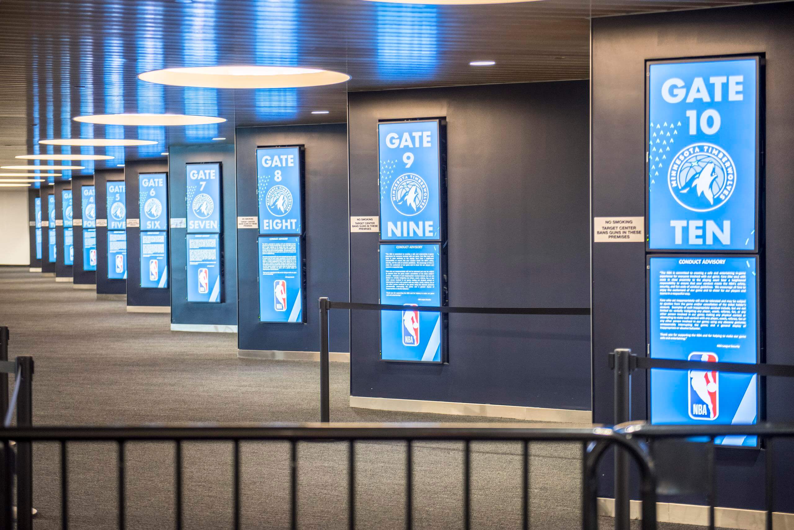
In a stadium setting, tier one information might include entrance signs and section numbers, tier two being amenities and seat rows, and tier three being seat numbers. As visitors move through the space, they’ll begin to anticipate where the signage and wayfinding they need will be located due to the hierarchy rhythm and consistency in design. This strategy works inside entertainment, hospital, and corporate venues regardless of scale or design features.
AN INTEGRATED APPROACH
While signage and wayfinding have their own unique purpose, we think of them in tandem from both an informational design and branding perspective. DI often serves as the branding, sponsorship and signage partner for our clients; therefore, thinking of these elements holistically helps us create a cohesive space and tells the brand story.
Our creative approach to signage and wayfinding starts as all DI design projects do – conducting a Discovery session to better understand the client’s brand, needs and vision. For signage and wayfinding initiatives, this often includes relevant design and architectural elements such as material palettes or internal finishes.
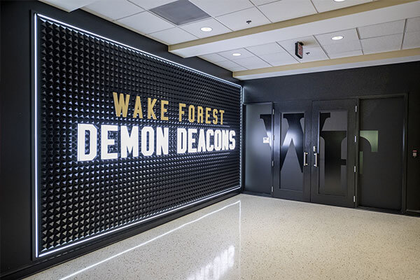
Our in-house capabilities allow us to create custom-made designs that fit the inherent need and space. Some clients, particularly in both the college and higher education spaces, often prefer their signage and wayfinding to exude their brand with logos and colors. In contrast, a corporate or healthcare client might steer toward more architecturally-focused or brand-agnostic signage and wayfinding elements.
SIMPLICITY + FUNCTIONALITY
Clean, simple and efficient should be the end goal. This is not the time to be overly flashy – a lesson we’ve learned over the course of many project audits. A lot of the venues we work with have an extremely wide demographic. From young children to seniors, everyone should be able to quickly and easily interpret the information. Digital signage and wayfinding can appear sleeker and more innovative. However, it can be difficult for older visitors to see clearly, let alone navigate.
A strong signage and wayfinding experience doesn’t necessarily stand out – rather, it blends into the venue’s design interior and effectively gets people the information they need when they need it.


